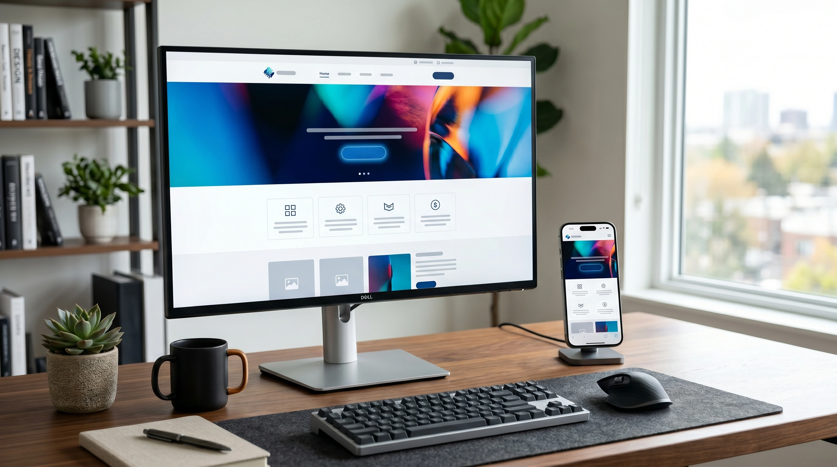
In the modern digital economy, your website is not merely a cosmetic display—it is an interactive funnel. If your site’s interface is confusing, reading your text is a chore, or finding your contact details requires extensive navigation, visitors will leave instantly. In 2026, **User Experience (UX) design is the single biggest factor separating high-converting sites from digital failures.**
UX design is not about making things "look pretty" (that is UI design). UX is the science of structuring an interface so that users can navigate it naturally, find the information they need easily, and complete a desired business transaction with zero friction.
This comprehensive guide breaks down ten foundational UX design principles every business website must deploy today to capture trust, build authority, and convert casual mobile searchers into loyal, high-paying clients.
What is UX and Why It Directly Impacts Your Revenue
UX is the direct bridge between a visitor's interest and your cash register. When a prospect lands on your website, they carry a specific intent (e.g., they want to find out what a pediatric dentist costs or want to see a developer’s portfolio).
If your UX is excellent:
- They find the information in under 3 seconds.
- They review high-trust social proof (reviews and logos).
- They are guided naturally toward a clear, frictionless contact button.
- The Result: They convert into a lead, booking, or sale.
If your UX is poor:
- They are hit with clunky, auto-playing video banners and popups.
- They struggle to read grey text on a white background.
- They get frustrated by a confusing mobile menu drawer.
- The Result: They bounce back to Google’s search results and click on your competitor. Your ad spend is wasted, and your revenue drops.
Principle 1–3: Visual Hierarchy, Whitespace, and Readability
Principle 1: Strict Visual Hierarchy
Visual hierarchy is the arrangement of elements in a way that implies importance. Human eyes scan web pages in specific patterns (commonly the "F-Pattern" for text-heavy pages and the "Z-Pattern" for visual landing pages). * **How to Implement**: Use size, weight, and color strategically. Your H1 header must be the largest font, followed by H2, then body text. Avoid making body text bold or colored unless it highlights a vital conversion keyword. Position your most important business value proposition in the top-left or center of the hero screen.
Principle 2: Generous Whitespace (Breathing Room)
Whitespace (or negative space) is the empty canvas space between elements like images, text blocks, and buttons. Amateur web designers try to pack every square inch of a screen with text and icons, assuming they need to show everything at once. This leads to cognitive overload. * **How to Implement**: Build generous padding (vertical margins of at least 80px to 120px between sections on desktop). Whitespace isolates elements, making your key call-to-action buttons stand out cleanly while signaling premium brand authority.
Principle 3: Elite Typography & Readability
If visitors cannot read your text easily, they will not understand your value proposition. * **How to Implement**: Keep font selections limited to a maximum of two font families (e.g. `Syne` for modern headings and `Inter` for highly legible body copy, which is the system we deploy at Peak Web Craft). Ensure body text is at least 16px to 18px in size, set line-height to 1.6 or 1.8, and limit line widths to 60-70 characters. Never use pure grey text on a light grey background—maintain high color contrast ratios (at least 4.5:1) to support accessibility standards.
Principle 4–6: Navigation, CTAs, and Mobile Experience
Principle 4: Frictionless Navigation
Your site navigation should be so simple that a child can find the contact page. * **How to Implement**: Keep primary header nav links limited to 5 or 6 items (Home, About, Services, Case Studies, Blog, Contact). Use familiar terms instead of creative labels (e.g., use "Services" instead of "Our Solutions"). Implement a "sticky" navbar that remains fixed at the top of the screen as users scroll down, so they never have to scroll all the way back up to click a menu link.
Principle 5: High-Contrast, Action-Oriented CTAs (Call-to-Action)
Your CTA buttons are the gateways to conversion. * **How to Implement**: Use a distinct, vibrant accent color that is not used anywhere else on the page (like Peak Web Craft’s vibrant blue `#0055FF` against our light neutral gray canvas `#F4F4F6`). Write specific, action-oriented button text (e.g., instead of writing "Submit" or "Click Here", write: "Get a Free Quote" or "Book an Appointment"). Position buttons in high-intent layout zones—at the end of key service sections and permanently in the top-right header nav.
Principle 6: Mobile-First Architecture
Over 60% of all global web traffic and over 80% of local searches are executed on mobile devices. Your website is no longer a desktop experience resized for mobile; it is a mobile experience that adapts to desktop. * **How to Implement**: Ensure tap targets (buttons and links) are at least 48px in height and width with generous padding to prevent accidental fat-finger clicks on mobile screens. Switch multi-column desktop grids into single-column vertical flows on mobile viewports. Check out our Landing Page design practices to see mobile-first conversion layouts.
Principle 7–9: Page Speed, Accessibility, and Trust Signals
Principle 7: Sub-Second Page Loading Speed
If your site takes longer than 2 seconds to load, your UX is broken before the visitor even sees your logo. Speed is not a technical vanity metric; it is the ultimate user experience factor. * **How to Implement**: Hand-code your component layers, compress all graphics into modern WebP format, and avoid heavy CMS page-builders (like Elementor or Divi). Our custom-engineered builds at Peak Web Craft deliver sub-second pagespeeds natively. Read about the performance impact in our Fast Loading Websites guide.
Principle 8: Design Accessibility (A11y)
Accessibility ensures your site is usable by everyone, including individuals with visual, auditory, or motor impairments. * **How to Implement**: Write descriptive `alt` tags for every image (supporting screen-readers), write semantic HTML elements (`