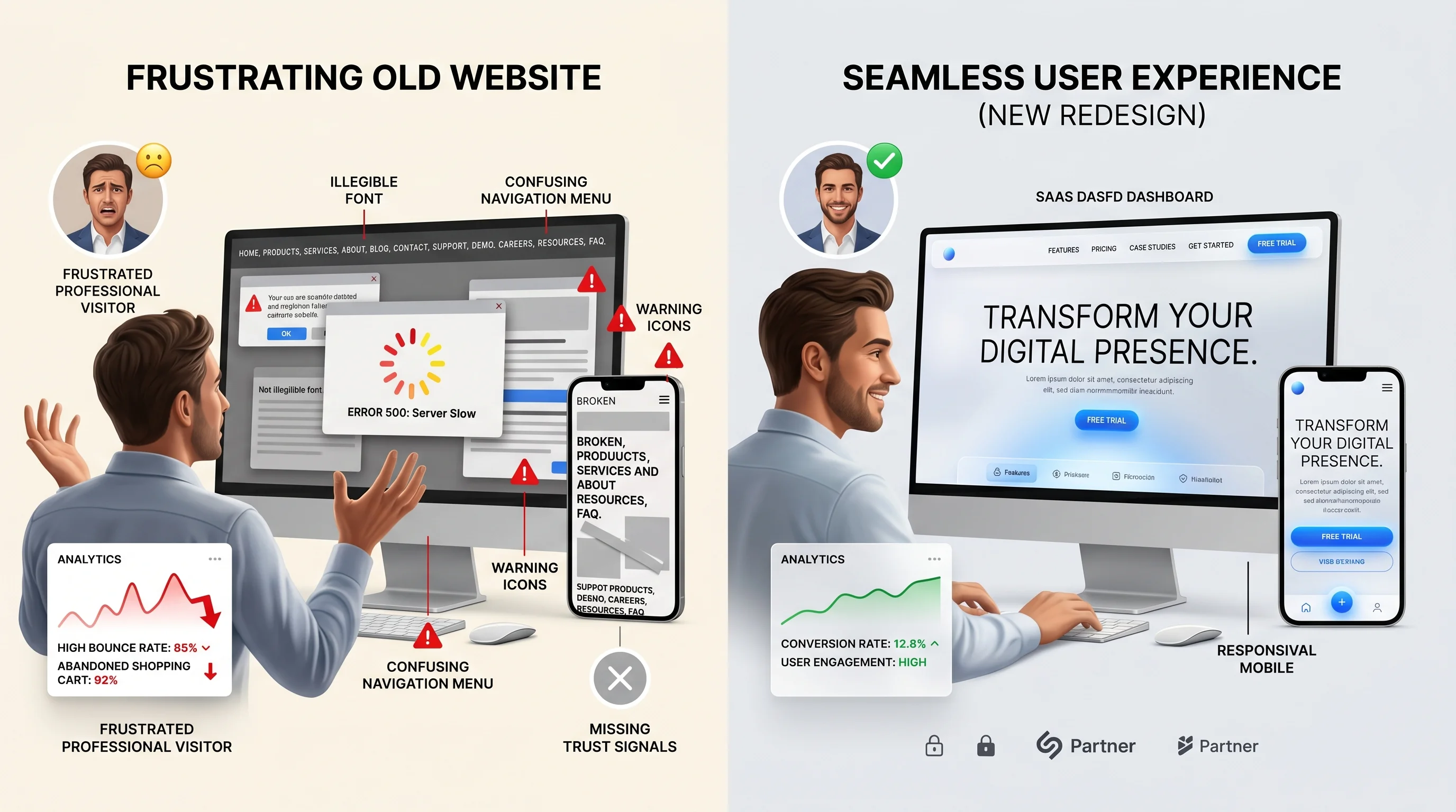
Most customers do not complain before leaving a website. They simply press back, close the tab, or choose a competitor. That makes website mistakes dangerous: they are silent. You may see traffic in analytics, but the lost trust and lost enquiries are harder to notice.
The mistakes below are especially costly because they affect the first impression. Fixing them can quickly improve engagement, enquiries, and the return on every marketing channel that sends visitors to your website.
1. Slow Loading Speed
A slow website creates frustration before the visitor sees your offer. On mobile, even a few extra seconds can feel like a broken experience. Common causes include heavy images, bloated themes, unnecessary scripts, cheap hosting, and unoptimized videos.
Speed matters for both SEO and conversion. If your website is slow, you lose visitors from organic search, paid ads, social links, and referrals. Start by compressing images, removing unnecessary plugins, improving hosting, and testing Core Web Vitals.
2. Unclear Messaging
Visitors should understand what you do within seconds. If your homepage leads with vague claims, internal jargon, or decorative copy, customers may not know whether they are in the right place. Clear messaging names the service, audience, outcome, and next step.
3. Poor Mobile Experience
A desktop design that looks impressive can fail on mobile if it was not planned responsively. Tiny text, overlapping sections, hard-to-tap buttons, awkward forms, hidden contact links, and slow mobile loading all make customers leave. Since many visitors arrive from phones, mobile experience should be reviewed first, not last.
Pro Tip: The customer does not separate your website experience from your business. If the website feels difficult, the business feels difficult.
4. Missing Trust Signals
Customers need proof before they enquire. A website with no testimonials, no real project examples, no clear contact information, no business location, no client logos, and no process details feels risky. Trust signals reduce uncertainty and make the next step easier.
- Show real testimonials or reviews.
- Add case studies or project examples.
- Display contact details clearly.
- Explain your process and timeline.
- Use professional images and consistent branding.
- Include FAQs that answer buyer objections.
5. Confusing Navigation and CTA Flow
Navigation should help visitors find the information they need quickly. Too many menu items, unclear labels, hidden service pages, and inconsistent CTAs create decision fatigue. A strong website guides visitors from homepage to relevant service pages, proof, FAQs, and contact.
How to Audit Your Website Quickly
- Open your website on mobile data, not office Wi-Fi.
- Check whether the hero section explains the offer without scrolling.
- Count how many clicks it takes to contact you.
- Review whether each service has its own useful page.
- Ask whether a stranger would trust the business after 30 seconds.
- Test page speed and fix the largest image and script issues first.
FAQ: Website Mistakes
Which website mistake is the most damaging?
Slow speed and unclear messaging are often the most damaging because they affect the first few seconds of the visit.
Can I fix these mistakes without rebuilding the whole website?
Sometimes. If the structure is sound, you can improve copy, images, CTAs, and speed. If the design system, mobile layout, or technical foundation is poor, a rebuild may be more efficient.
Final Thoughts
Customers leave websites that feel slow, unclear, untrustworthy, or difficult. Fix those basics and your website will immediately feel more professional. Peak Web Craft helps businesses build business websites and landing pages that make the next step clear.