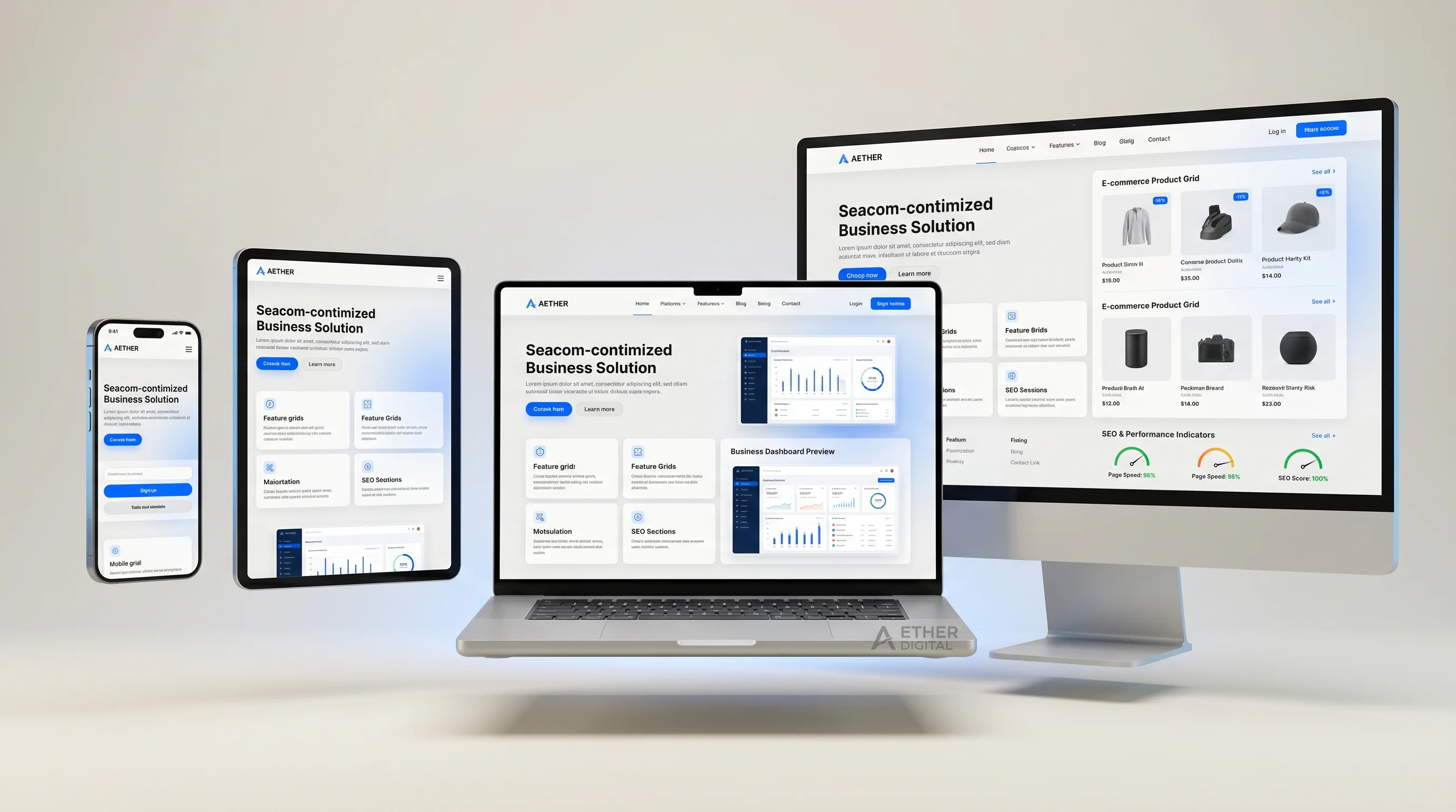
Responsive web design means your website adapts to different screen sizes and input methods. It should feel natural on a phone, tablet, laptop, and large desktop monitor. For modern businesses, this is not a design preference. It is a requirement for search visibility, user trust, accessibility, and conversions.
Customers do not experience your website in one perfect desktop layout. They arrive from Google on mobile, open links from WhatsApp, compare providers on tablets, revisit later on laptops, and sometimes send your site to decision-makers on larger screens. A responsive website keeps the experience consistent across all of those moments.
Mobile Is Often the First Impression
For many industries, mobile traffic is the majority. Even in B2B, decision-makers often discover businesses on mobile before evaluating them on desktop. If your mobile website is cramped, slow, confusing, or hard to tap, visitors assume the business behind it is equally outdated.
Responsive Design Supports SEO
Google evaluates mobile usability as part of the page experience. A responsive website makes it easier to maintain one URL, one content structure, and one SEO strategy across devices. Separate mobile sites create more technical complexity and are rarely the best path for small and mid-sized businesses.
It Improves Conversion Rates
A responsive website removes friction from the buying journey. Buttons are easier to tap, forms are easier to complete, service pages are easier to read, and CTAs remain visible at the right moments. When users can move through the page comfortably, more of them enquire.
It Protects Brand Credibility
Your website is often judged before your sales team speaks to the prospect. Broken layouts, tiny text, overlapping sections, distorted images, and awkward menus make a business look less professional. Responsive design signals that your company pays attention to details.
Pro Tip: Responsive design is not just making a desktop layout smaller. It is planning hierarchy, spacing, images, menus, CTAs, and content flow for the way people actually use each device.
What Good Responsive Design Includes
- Mobile-first content hierarchy with the most important message visible early.
- Flexible grids that adapt without awkward gaps or compressed content.
- Readable typography with comfortable line length and spacing.
- Touch-friendly buttons, forms, menus, and interactive elements.
- Responsive images that load at appropriate sizes.
- Testing across real viewport widths, not only one phone mockup.
- Performance optimization for mobile networks.
Responsive Design for Ecommerce and Service Businesses
For ecommerce websites, responsive design affects product browsing, cart completion, payment trust, and repeat purchases. For service businesses, it affects enquiry forms, phone calls, WhatsApp messages, booking flows, and local search behavior. In both cases, mobile friction becomes revenue friction.
Common Responsive Design Mistakes
- Designing only for desktop and shrinking the layout later.
- Using images that crop important product or service details on mobile.
- Placing CTA buttons too far down the page.
- Using font sizes that are too small for comfortable reading.
- Creating mobile menus that hide key pages or contact actions.
- Forgetting to test forms and checkout flows on real devices.
FAQ: Responsive Web Design
Is responsive design different from mobile-friendly design?
Mobile-friendly usually means the site works on mobile. Responsive design is broader: the layout adapts across many screen sizes and devices while preserving usability and visual quality.
Do I need a separate mobile website?
Most businesses do not. A well-built responsive website is usually simpler to manage, better for SEO, and more consistent for users.
Final Thoughts
Responsive web design matters because your customers are already multi-device. A modern website should meet them wherever they arrive. Peak Web Craft builds business websites, landing pages, and ecommerce experiences with mobile-first responsive design baked into the structure from day one.