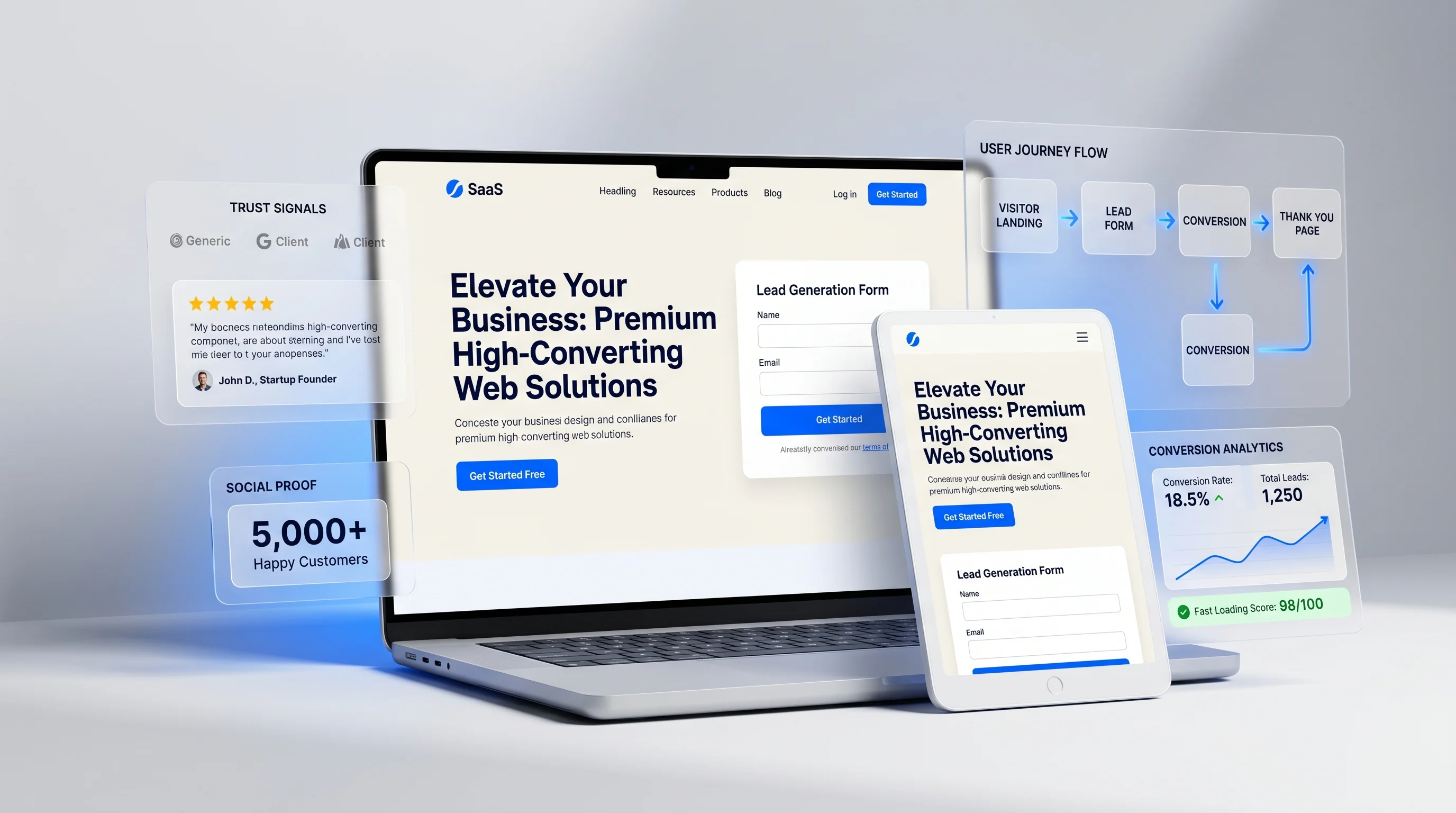
A landing page has one job: turn focused attention into a specific action. That action may be booking a call, requesting a quote, downloading a lead magnet, registering for an event, buying a product, or joining a waitlist. Unlike a full website, a landing page should not try to explain everything about the business. It should make one offer feel clear, credible, and easy to act on.
Higher conversions come from structure. Design matters, but design without strategy creates attractive pages that do not sell. The best landing pages combine clear positioning, persuasive copy, fast performance, trust signals, frictionless forms, and a CTA path that is impossible to miss.
Start With One Audience and One Offer
A landing page becomes weak when it tries to speak to everyone. Before design begins, define the audience, the pain point, the offer, the promise, and the action. A landing page for startup founders should not sound like a landing page for local clinic owners. A Google Ads landing page should match the search query that brought the visitor there.
Write a Hero Section That Passes the Five-Second Test
The hero section should answer three questions immediately: What is this? Who is it for? Why should I care? A strong hero includes a specific headline, short supporting copy, a primary CTA, and often one trust signal such as a client count, testimonial, rating, result, or guarantee.
Weak hero example
"Digital solutions for modern growth" sounds polished but says very little. It does not name the offer or outcome.
Stronger hero example
"Get a high-converting landing page for your next ad campaign in 10 days" is specific. It names the deliverable, audience context, and timeline.
Design the Page Around a Persuasive Sequence
A landing page should feel like a guided sales conversation. The order of sections matters. A typical high-performing structure includes hero, problem, solution, benefits, proof, how it works, offer details, FAQs, and final CTA. Visitors should not have to assemble the argument themselves.
- Hero: clarify the offer and action.
- Problem: show that you understand the visitor's situation.
- Solution: introduce your service or product as the better path.
- Benefits: explain what improves for the customer.
- Proof: add testimonials, results, case studies, or client logos.
- Process: reduce uncertainty by showing what happens next.
- FAQ: answer objections before they block the enquiry.
- Final CTA: make the next step simple.
Use CTAs That Match Visitor Intent
Not every CTA should say "Submit." Strong CTA copy reflects the value of the action: Get My Quote, Book a Free Consultation, Start My Website, Download the Guide, Reserve My Slot. For service landing pages, repeat the CTA after key sections so visitors can act when they are ready.
Pro Tip: A landing page should reduce decisions. Remove unnecessary navigation, unfocused links, vague copy, and anything that distracts from the primary conversion action.
Make Forms Easy to Complete
Forms are where many landing pages lose leads. Ask only for information needed to start the conversation. For high-ticket B2B services, a few qualification fields can improve lead quality. For local services or simple offers, shorter forms usually convert better.
Add Trust Where Doubt Appears
Trust signals should not be dumped into one section at the bottom. Place proof near claims. If you mention results, support them with a case study. If you ask for contact details, show privacy reassurance. If the offer has a price or timeline, explain what is included.
Optimize for Speed and Mobile
Landing pages often receive paid traffic, which makes speed essential. Compress images, avoid heavy scripts, keep animations light, and test the page on mobile. A landing page that loads slowly or breaks on small screens wastes campaign budget.
Measure the Right Things
- Traffic source and campaign quality.
- Scroll depth and section engagement.
- CTA clicks by section.
- Form starts and form completions.
- Conversion rate by device.
- Lead quality after sales follow-up.
FAQ: Landing Page Design
How long should a landing page be?
It should be as long as needed to answer the visitor's objections and no longer. Simple offers may need short pages. Expensive services often need more proof, detail, and FAQs.
Should landing pages have navigation?
For focused paid campaigns, minimal or no navigation often works better because it keeps attention on the offer. For SEO landing pages, some internal linking may be useful if handled carefully.
Final Thoughts
The best landing page design practices are not decoration tricks. They are clarity, focus, trust, speed, and conversion discipline. If you need a campaign-specific page, Peak Web Craft can build a landing page that matches your offer, audience, and marketing channel.